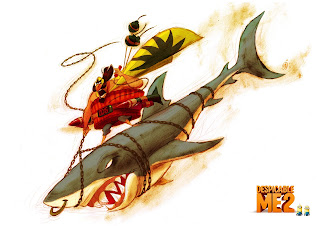
I will be the first one to admit, I was a bit uneasy about the idea of having another Despicable Me. As a film, I liked the first one, as for the designs, I really liked the main character and the three children, but the rest of the characters in the world left little to like, especially the main villains Vector and his dad. I felt they were very plain and uninspiring.
When I saw those characters, they reminded me of these two guys...
I was kind of bummed, especially when I saw all the amazing designs (see below) that Sergio Pablos and his amazing artists at SPA Studios did earlier before they sold it to Universal Pictures.
I do understand, that the story did change over time, so maybe the design choices were due to things I don't understand or know about.
Now it's 2013 and Despicable Me 2 is soon to be released here in the USA, and I was worried they might pull a "lets get money while we can and quickly put out a second movie with little thought or interest in making it special" that some film sequels have been doing recently. Not naming any names, but if you felt guilty reading this then you know who you are.
To my pleasant surprise when I saw all of the trailers and clips from this show... I was in love. I looked a little like Dave here below ready to kiss and hug all the people who had worked on the film.
Now I am strictly talking about the look and feel of the film. I have yet to see it. But I have heard lots of people that have seen it, and have really liked it a lot. Anyway on with the happy thoughts...
The film looks AWESOME, all the designs both main and background characters look unique, appealing, and they all look like they are in the same design world. It looks like they had a lot more time and money to spend on this second film. It looks like they took their time to make every character shine, and have their own unique personality and shape.
Below are some screen grabs from the film that I thought were the best to show off some of the wonderful designs.
The first Character is Eduardo / El Macho...
Lucy Wilde
Other Fun Characters
So long story short. I want to applaud all those who worked on Despicable Me 2. I can not wait to go see this film, and my boys are going crazy asking me when we can go see it. So Bravo Illumination Entertainment. Here's hoping they make a whole bunch more of these.
If any of you artists that are reading this have worked on the film, and you are able to send me some approved artwork from the film, could you please send me some? I would love to show it off here. Please email me the artwork at characterdesign@gmail.com
Below is some artwork from the film. The only sad thing with this film, is that I really wished they had an Art of Despicable Me 2. Maybe next time. Hint Hint.


